Grand Designs: House of the Year viewers slam extension with faux mountain
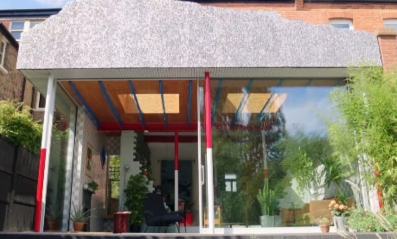
A ‘hideous’ property with a modern extension featuring a faux metal mountain attached to it was slammed by Grand Designs: House of the Year viewers last night.
In the third programme of the series, which aired last night on Channel 4, Kevin and his co-presenters, architect Damion Burrows, Natasha Huq and design expert Michelle Ogundehin, visited five properties battling it out for a place on the shortlist, all of which pushed the boundaries in conventional design.
The final home featured on the show was called Mountain View, in London, with architect Matt designing the property and it’s unusual extension for his young family to live in.
However many of those watching were left stunned by the build, with one commenting: ‘The final house on Grand Designs tonight is the most horrible thing I’ve ever seen. It looks like a 90s Spanish go-kart track clubhouse.’
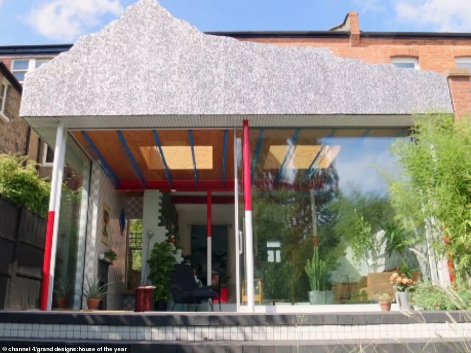
A ‘hideous’ property with a modern extension featuring a faux metal mountain attached to it was slammed by Grand Designs: House of the Year viewers last night
Another wrote: ‘So an extension with a stupid board to pretend it’s a mountain. Yeah, really clever stuff. Yawn!’
A third added: ‘Some utter garbage on House of the Year tonight. Lawrence Llewelyn Bowen meets can’t quite decide what rubbish to use.’
Earlier in the series, Kevin explored homes completed in challenging circumstances, as well as awe-inspiring homes.
But last night, the presenter explained each of the different houses ‘does their own thing’.
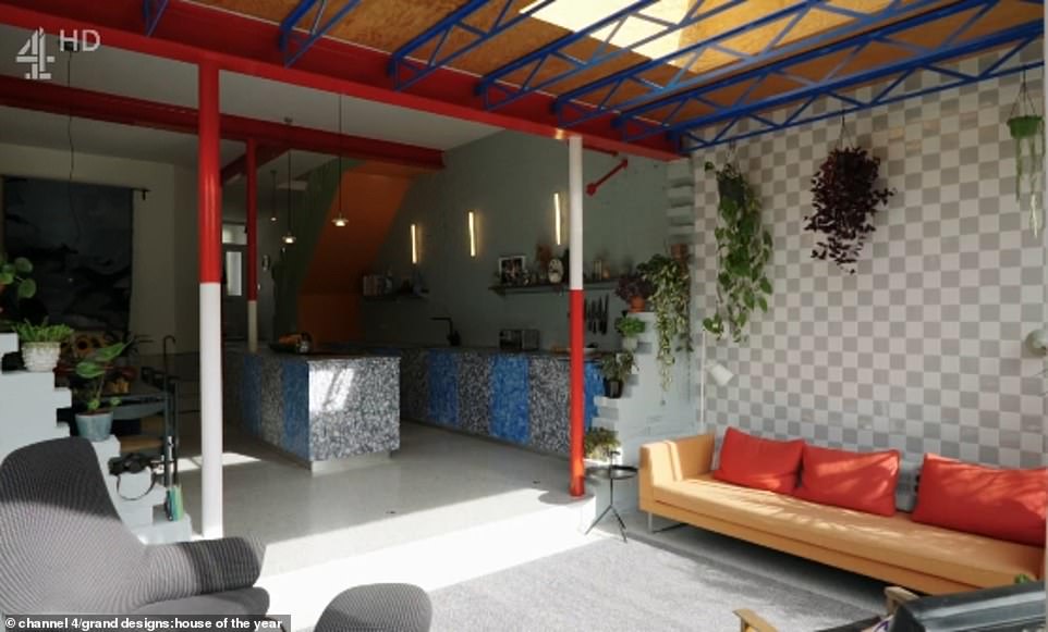
Inside the extension was an open-plan kitchen, dining and living area, which featured a number of unconventional design choices
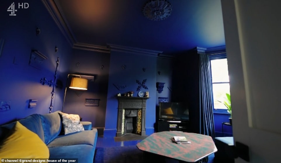
Meanwhile the living room at the front of the property had been painted in a deep blue tone, which spread from the ceiling down to the carpeted floor
He said: ‘These are buildings that boldly go where no house has gone before, making us rethink what a home can be.
‘[They are] trailing new revolutionary space and maybe even accidentally starting a brand new architectural movement all by themselves.
‘These are mould breaking houses, that showcase the power in taking risks. Where they lead, the rest of us, will surely follow.’
The final pioneering original home was hiding behind the back of a primped and proper home in South West London.
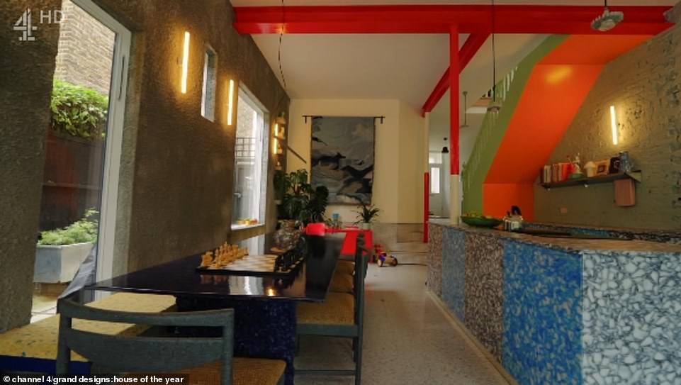
The kitchen had been built with recycled objects, with Matt’s wife Laura admitting she did need some ‘convincing’ about the design choices when they first started the build
It was an extension and remodelling of an existing house which dramatically rethought what a home can look like.
The pioneering mind behind it all was Matt, a young architect, who lived there with his wife Laura and their children.
She said: ‘There were so many things which I’m just not convinced of, and I needed convincing. And I wouldn’t necessarily choose you as my architect.’
From the front door, you pass a renovated living room and then everything after that had been remodelled, with a new utility room and a main family area.
It was sunken from the original level, with dining, seating and eating. Upstairs were the original rooms within the building.

Matt and Laura, who have two young children, confessed they had discussions about her ‘concerns’ over the design, but ultimately decided the architect should be able to ‘really go for it’
And at the back was a mountainous extension, which included a mountain landscape made from foam aluminum.
Matt wanted his family’s home to express all the things they were interested in – explaining: ‘We saw these pictures of a Disneyland ride in San Diego where they were making this hyper realistic mountain and we thought, why not try to replicate it.’
Laura said: ‘Like every idea he has, I was very concerned. But I know it was his one opportunity, given that its our house, to really go for it and do something that he loves, that any other client would be worried about.’
The RIBA judges enjoyed the surreal experience of the house, as well as the individuality and personal expression.
And it’s not just Matt who has had his personal interests replicated in the home – the columns, painted red and white, replicated the poles used to map landscapes, while sunken in the floor are survey markers.
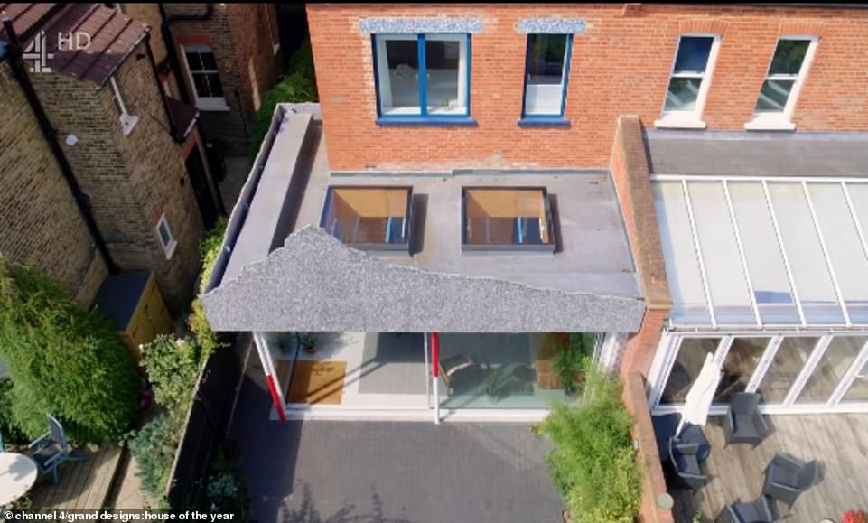
Matt wanted his family’s home to express all the things they were interested in, and was inspired to build the faux metal mountain on the back of the extension by a Disneyland ride
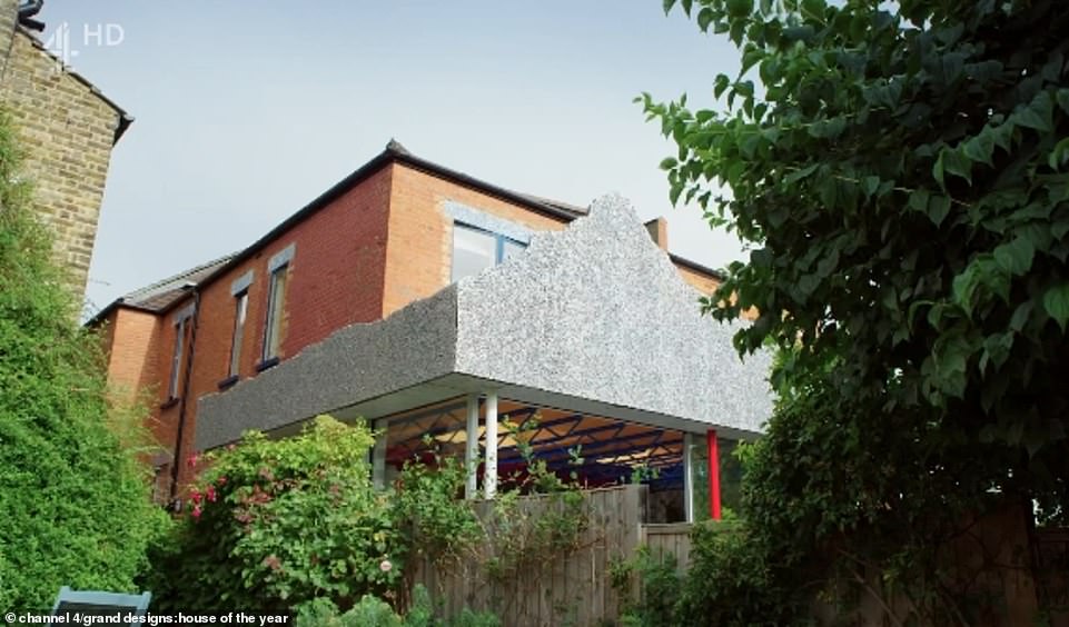
The large metal mountain which was built onto the back of the extension was visible from the next door neighbour’s garden (pictured)
Both are references to Laura’s days as a Geography student. She said: ‘I love nature and the outdoors and the natural landscape. There’s references throughout.’
Stepping inside was described as ‘a theatrical experience’, revealing rooms full of references waiting to be decoded.
Laura said the couple were ‘really keen’ not to lose the original character of the house, so the brick wall was retained.
The mixtures of styles, materials and textures in the house made it a kaleidoscope of taste.
The original house was a hotch-potch of Edwardian spaces. To transform the space cost £220,000 and they didn’t stop downstairs.
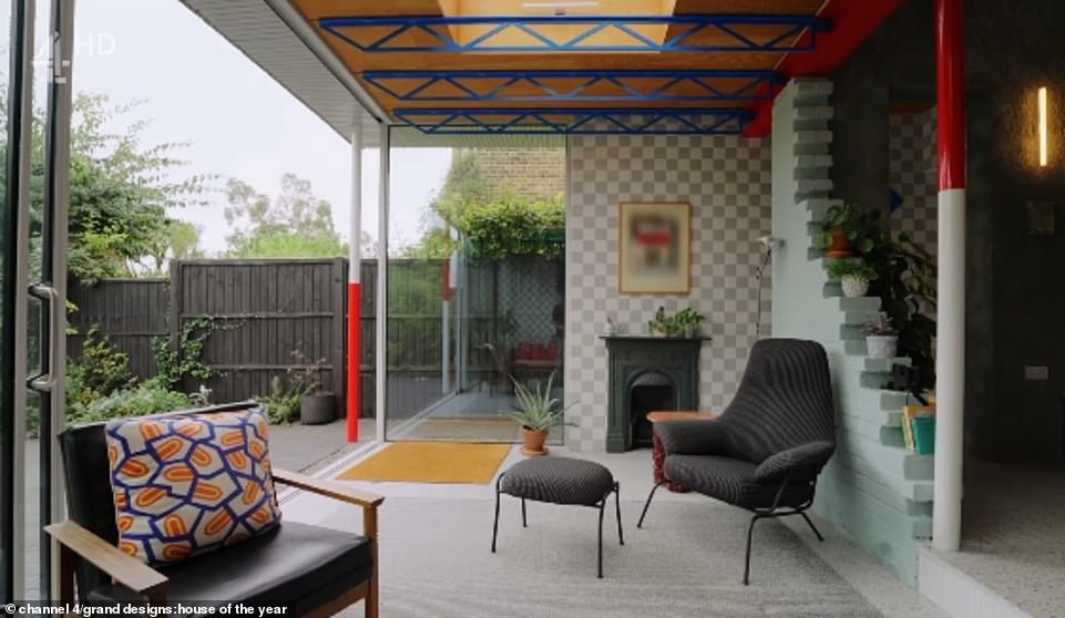
Matt and Laura integrated personal references into the unusual renovation, which cost them £220,000 to complete (pictured, the extension)
Upstairs was a bright and airy hallway, which opened right up to the roof.
Laura said: ‘The age old question we get asked with this house is, why did we do certain things, why did we put a mountain on the back. And the answer becomes, why not? And that just infiltrates into your life as well.’
Kevin explained that while the house may make Matt and Laura happy, it’s also fun, pioneering and deeply, deeply odd.
He said: ‘There are so many great qualities that architecture can bring to our lives. All good, all recognisable – and then there are those harder to spot qualities, the emotional ones – the joy and light that a building can bring to people’s lives.
‘Let me tell you with this building, the joy and delight are absolutely palpable.’


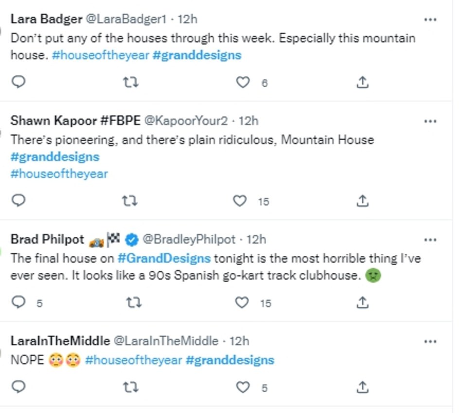


Despite Matt and Laura’s enthusiasm for the property, many of those watching declared the home was ‘hideous’ and compared it to a children’s play area


